20 Jul 2025
Making PixelBuilds more accessible, bringing a niche project to everyone.
A UX/UI and branding project for an open-source Android ROM aimed at reviving older devices.

UI/UX designer (solo)
Role
3 months
Duration
2023
Year
Figma, Jitter, HTML, Tailwind CSS, Git
Tools
Project overview
In 2023, I was responsible for the design of the brand identity and webpages of PixelBuilds. My responsibilities included research, UX strategy, interface design, copywriting, and animation. I worked as the sole designer on this project, collaborating with two developers. The project was volunteer-led and non-profit, so all work was done pro bono over a three-month period.
PixelBuilds is an open-source Android operating system, designed to bring new features and improve performance on older devices no longer supported by the manufacturer.
The goal was to create a clean, beginner-friendly website that clearly communicates the projects goal, how to use it and how to get involved, without overwhelming visitors with technical language.
The challenge
Custom ROM projects often have a high barrier to entry. Documentation is either minimal or extremely technical and websites are usually built by developers, for developers often leaving newcomers confused or discouraged.
After analyzing the landing pages of other projects, I identified several recurring issues:
Overuse of technical language without explanation
Poor visual design and outdated UI
Copywriting that lacked clarity or emotional appeal

The solution
I designed the website from scratch to eliminate jargon, prioritize accessibility, and clearly communicate how users can get started or contribute. The experience was tailored for two primary personas:
curious newcomer - someone who discovered the project for the first time with no prior experience flashing ROMs
experienced user/developer - someone familiar with the concept of a ROM, potentially interested in contributing code
Designing the experience
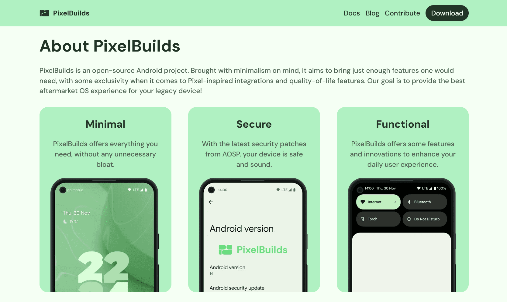
Landing Page
The homepage introduces users to PixelBuilds with a focus on approachability and friendliness. I avoided technical terms, highlighting what matters most:
What PixelBuilds is (an open-source Android OS)
Who is PixelBuilds for (users with older, unsupported devices)
Why choose PixelBuilds (goal is to provide the best aftermarket OS experience)
The main value propositions, Minimal, Secure, and Functional are presented as simple feature blocks with short descriptions and screenshots. This allows visitors to quickly understand what the ROM offers without reading through long paragraphs or documentation.
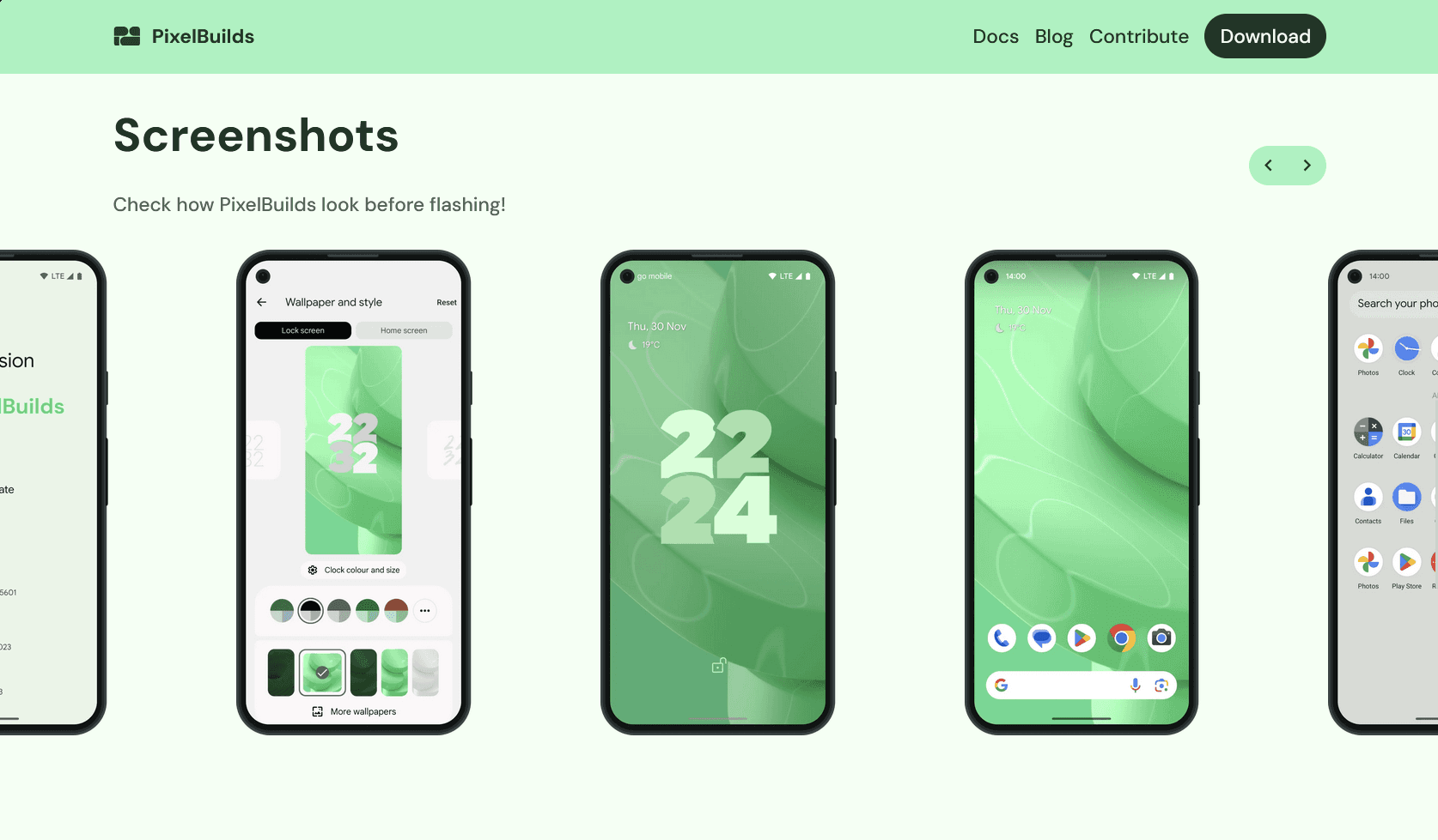
To support visual learners, I included a Screenshots section early on. Seeing that the OS looks familiar builds trust and makes the idea of flashing feel less intimidating.
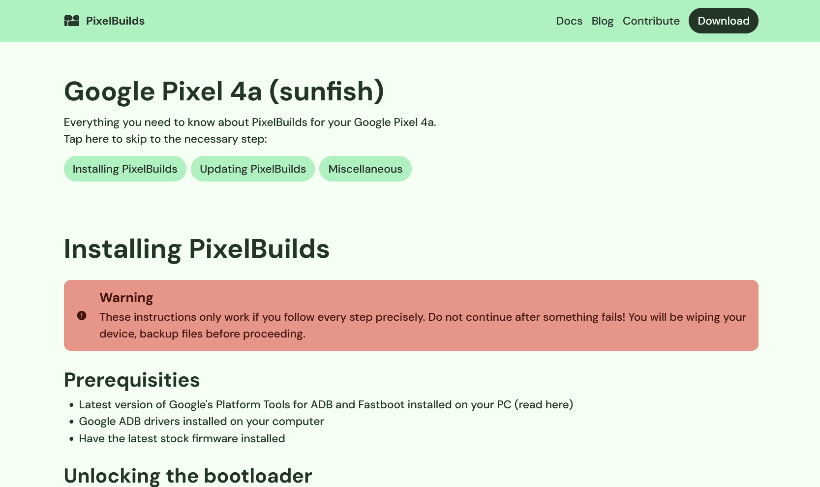
Download Page
The Download page was designed with simplicity and trust in mind. I wanted the process of checking if your device is supported and installing the ROM to feel safe and clear — especially for someone who’s never done this before.
Each supported device has its own dedicated page, which includes:
The build date and file download
Important compatibility notes
A step-by-step installation guide, written in plain language for each device
Links to documentation, recovery tools, and Telegram support groups for further assistance
This avoids the common pitfall of dumping all users into a single, generic “how to install” page. Instead, each user sees only the relevant instructions for their device, making the experience feel more personalized and manageable.
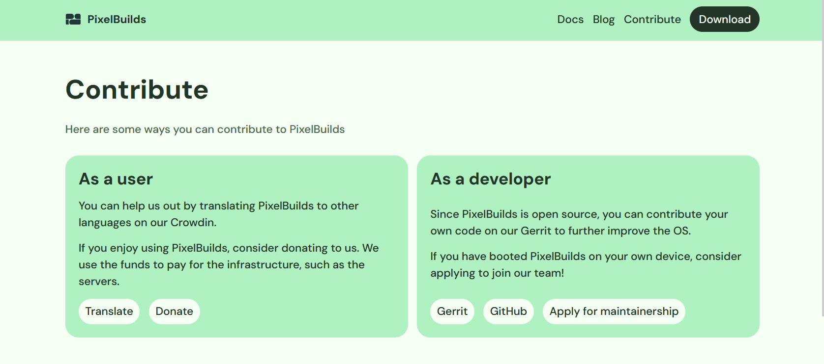
Contribute page
To support the open-source nature of the project, I designed a Contribute page that splits contributors into two clear paths:
For newcomers: suggestions include helping with translations via Crowdin or the donation link, as the infrastructure costs are paid by the developers
For developers: links to the source code on GitHub and Gitea, documentation, and Gerrit for code review.
By dividing this page into two columns based on skill level and familiarity, I made it easier for anyone, regardless of technical background to find a way to participate. This directly supports the project's goal of being more accessible and community-driven.
Visual Design
Design Language
PixelBuilds' design takes heavy inspiration from Material Design 3, aligning with its Android foundation. Rounded corners, surface elevation, and a structured visual hierarchy create a UI that feels both familiar and modern for Android users.
I focused on simplicity, legibility, and calm color tones to make the website feel less intimidating for newcomers who might already be overwhelmed by the idea of installing a custom OS.
Brand Identity
PixelBuilds was originally envisioned as an operating system for multiple form factors; phones, tablets, cars, and TVs. I reflected this vision directly in the logo, where the letters P and B are constructed using four distinct blocks, each representing one of these device types.
To reinforce this vision, I designed a hero animation on the landing page using Jitter. The animated logo shows blank-device silhouettes for a phone, tablet, car dashboard, and a TV.
As Google's MD3 uses colors from the wallpaper for the interface, for the branding I opted for the same palette as a phone running PixelBuilds with the stock wallpaper. This little touch creates a bridge between the website and system UI.
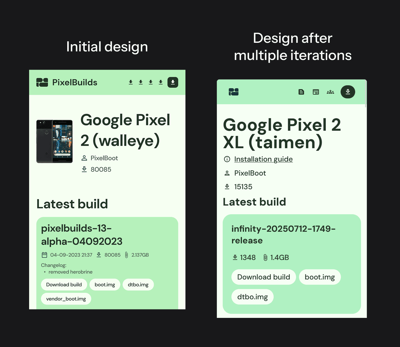
Iterations, iterations, iterations
One of the most valuable lessons came after launch, through observing how users interacted with the site.
Originally, the installation guide was placed at the bottom of each device build tile, underneath the files and changelogs. Over time, we noticed a recurring issue: users were missing the installation instructions entirely.
To address this, we relocated the guide link directly under the page header, just beneath the device name, maintainer, and download stats. This small UX tweak significantly reduced user confusion and support questions.
Additionally, we went through multiple iterations on spacing and padding, especially around buttons, headers, and mobile layouts, refining element sizing to feel more touch-friendly and breathable across different screen sizes.
These subtle changes reminded me that great UX isn’t always about redesigning everything as sometimes, a few pixels and better hierarchy make all the difference.
Looking ahead, here’s how I’d further evolve the project:
Conduct usability testing with first-time ROM installers to refine the installation flow
Experiment with A/B tests
Implement a visual flashing guide, instead of it being text-based, which would take a lot of time as it is device-specific
Outcome and Reflections
Although I didn’t conduct formal UX research or usability testing, the project made a clear and measurable impact:
PixelBuilds has seen over 200,000 downloads, and the website receives steady traffic from global users.
I received positive feedback from community members who appreciated the clarity of the website and the simplicity of the install instructions, especially from newcomers who had never installed a custom ROM before.
Several contributors joined the project after discovering the Contribute page, which successfully lowered the barrier to getting involved.
Personally, this project taught me how to design for a niche but passionate technical audience, and how to balance approachability with accuracy. It was also my first time working with animated branding, and I found that even subtle motion can powerfully reinforce product vision.
Learn more
If you are interested in learning more about the project, feel free to visit the following websites: